Space, the final frontier. Well, not exactly, but when it comes to graphic design it’s pretty important to “explore” (pun intended) its use. In fact, the use of space within a design is often a factor that is not considered enough, especially regarding how it can be used to compliment the other elements of design. So to begin, let’s determine what constitutes space.
Featured Image: Posters by Warsheh licensed under CC BY-NC-ND 3.0
Other posts in this series:
How to Apply the 7 Elements of Design to your Work. Element 1: Line.
How to Apply the 7 Elements of Design to your Work. Element 2: Shape.
What is Space?
Space can be described as the distance around and/or the area between design objects or elements. As an example, if you were to place an image on a page, the area that does not contain the image would constitute space. Furthermore, this can be called white space (if placed on a white page) or negative space.
Negative Space
It is all too easy just to concentrate on the shapes (images, text, graphics) we place on a page when generating a design and forgetting about the negative space that surrounds them. Even something as simple as page margins needs careful consideration to ensure this negative space is used to it’s full potential. Negative space gives the eyes a place to rest, which in turn helps the reader to consider and absorb the other elements on the page. As a result, the underlying message of the design is better communicated.
Have you ever heard the term “this design is very busy”? Or have you seen a design and thought, “man, this gives me a headache just looking at”? This is most likely due to the fact that there is not enough space surrounding the elements. Space visually organises elements on a page; it helps to create focal points, special relationships and areas of interest.
Tips for Using Space in Your Designs
- The use of space is particularly important when your design contains many of the other elements of design.
- Larger page margins will give a page a more ‘upmarket’ look and make it easier to follow.
- Carefully consider the placement of imagery that contains people so they have space to gaze or look into.
- To tie objects or elements together, only use small amounts of space between or around them.
- You can highlight an object (making it a focal point) by using large amounts of space around it.
- Don’t be afraid of space. There’s no need to fill up every area on a page. Remember, space gives the eyes a place to rest!
Examples of Space in Design.
Below are a number of examples that showcase how space has been successfully used in everday design.

Unfold Sound of Yoga by Martin Sitta licensed under CC BY-ND 3.0
Unfold Sound of Yoga
This is a great example of using white/negative space within a layout. Take note how there very few elements on each page; however, with careful placement the layout is still well balanced. This has produced a very clean, contemporary and calming layout which is well suited to the topic. Another concept to consider is that the layout portrays the ying and yang symbol with the use of strong positive shape and negative space. Again, this is indicative of the topic.

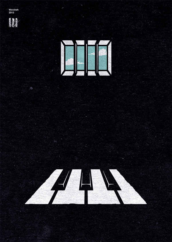
Posters by Warsheh licensed under CC BY-NC-ND 3.0
Poster
This example highlights the importance that both negative and positive space can have within a design. Negative space should be considered as a shape/s within a design that holds as much importance as the other elements. As seen here, the negative space tells as much of a story as the positive space.
![]()
Valley Roofing Logo by Curtis and Walsh licensed under CC BY-ND 3.0
Valley Roofing Logo
Negative space can be cleverly used within logo design. In this example, imagery has been incorporated into the negative areas of the typeface, which has resulted in a flawless integration of both logo and type. This is called a Logotype.
Final Words
Now that you have an understanding of negative space within design, make sure you consider this when designing your next piece. Remember, each time you create a shape within a design you are in turn creating negative space.
Enjoyed this post? Please share using the buttons below.